Initial delivery
1 weekend
I explored the initial concepts and built both website versions over Saturday and Sunday, ready for review on Monday. The demonstrations shown here include later refinements.
Easy English / AI-assisted delivery
I took a specialist service from audience research to a working website, using AI across the disciplines that normally sit between strategy and launch. The result connects a clearer offer, a distinctive visual identity and a practical enquiry journey.
Explore the work
Easy English Australia
01 / The challenge
The people commissioning an Easy English document are not necessarily the people who will read it. A commissioner needs to understand the service, the process, the source material required and how to request a quote. The document itself serves readers who need information in a more accessible format.
The original site explained the service, but left an organisational buyer to piece together the offer, the evidence and the next step. I rebuilt that journey around the questions a buyer needs answered: is this right for our audience, can we trust the process, and what do we need to provide?
Make the buying decision clearer without losing sight of the person who needs the information.
Reviewed the existing site, comparable Australian providers and public accessibility guidance. Distinguished the commissioning audience from the document reader, then identified the questions about accuracy, process and scope that the website needed to answer.
Organised pages around the buying journey. Wrote the service promise, supporting explanations and calls to action so a visitor can see what the business does, who it serves and how to begin.
Reviewed wording for clarity, consistency and unsupported promises. Historical statistics needed dates and context. Copy had to explain the service without implying that a website redesign itself guarantees accessible documents or commercial results.
Developed the warm paper-cut visual language, directed the illustrations and refined staff portraits into a consistent treatment. Composed different artwork for desktop, tablet and mobile so the imagery supports the copy rather than competes with it.
Built the page structure, responsive layouts, navigation and structured quote journey. Connected headings, page titles and service language to the questions visitors bring, with clear paths between related pages.
Refined the work through feedback and browser checks, including image crops, text placement, navigation and motion. The two working directions make the design decisions inspectable, rather than leaving the case at a set of mockups.
03 / Explore the websites
Initial concept directions and wireframes took minutes to explore. I carried the chosen visual direction into two working websites over a weekend, ready to review on Monday. The client selected the multi-page version. These demonstrations include subsequent refinements; forms do not send enquiries or upload files. Each website opens in a new tab, keeping this case study available.
01 / Client-selected direction
A multi-page structure separates the service, format, process and enquiry. Visitors can enter through the question they need answered, with a dedicated page for each part of the offer.
Explore the multi-page site02 / Alternate direction
The scroll-led, single-page version uses editorial motion to explain the offer, show the work and lead into the brief. It makes the alternative journey tangible, rather than asking the client to imagine it from a wireframe.
Explore the single-page siteThe opening, before and after
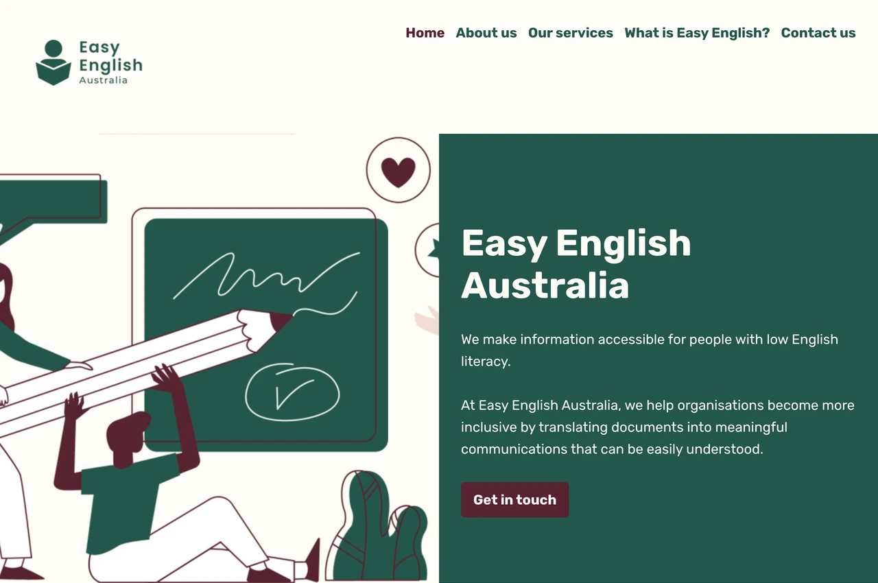
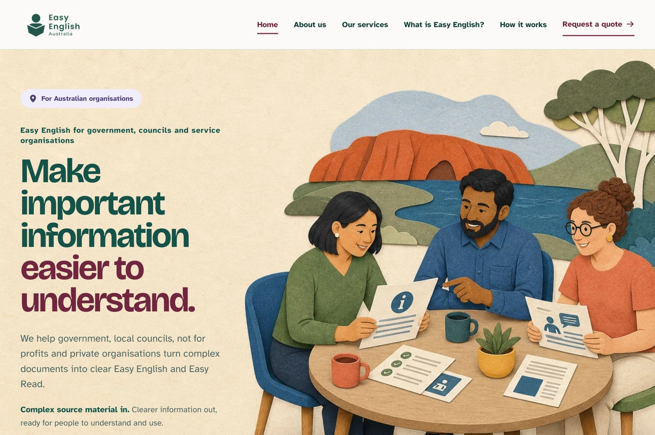
From a general service introduction to a clearer promise for the people commissioning the work.
04 / Results
Initial delivery
I explored the initial concepts and built both website versions over Saturday and Sunday, ready for review on Monday. The demonstrations shown here include later refinements.
Working alternatives
A scroll-led single page and a multi-page experience, carrying the research, copy, illustration, design and development through to something the client could explore.
Client decision
The client chose the multi-page version after exploring both experiences. That decision gave us a concrete direction for further refinement.
I directed the research, writing, editing, visual system and implementation. AI expanded what I could execute; I remained responsible for the decisions and review. The original five-page website is preserved as a dated visual archive. These redesigned versions are portfolio demonstrations, not the business’s live service.
A related challenge?
For conversations about measurement, applied AI and digital experiences that help people act.
Start a conversation