Find the relevant answer.
Descriptive headings, distinct service explanations, related pages and practical questions make the subject easier to explore.
A heritage specialist. An unmistakable presence.
Their website should, too.
A grand first impression. Care in the smallest detail. And a practical path from loving a period home to knowing how to care for it.
Step inside the experience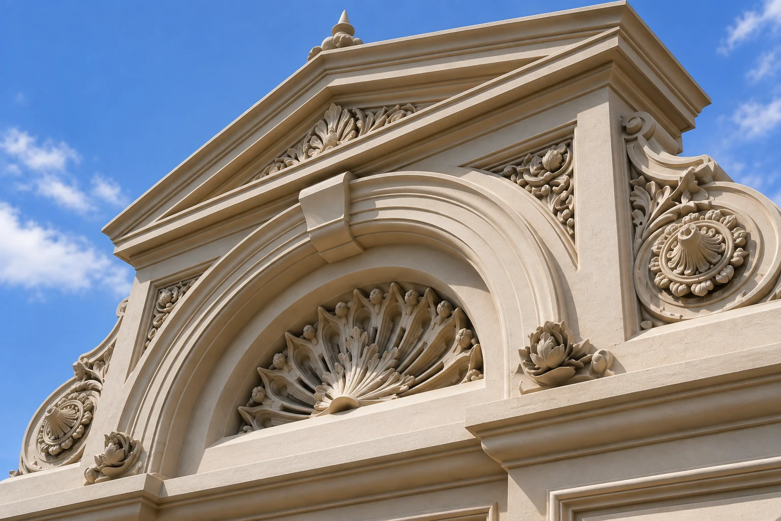
01 / The house takes the whole stage
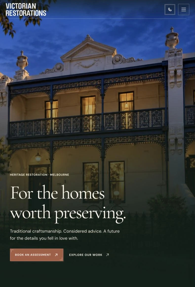
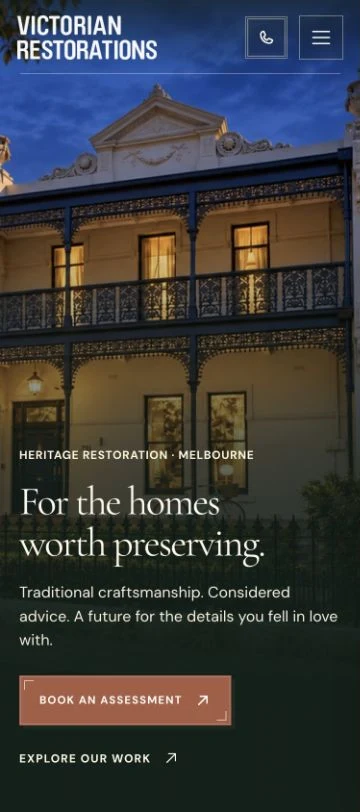
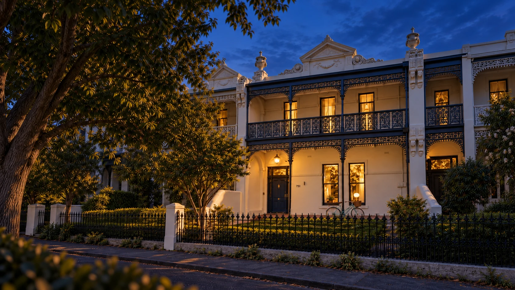
The facade fills the opening. Fine ironwork, tall windows and a generous roofline give the craftsmanship room to register. Change the screen size below: the composition adapts, while the invitation to care for the home stays clear.
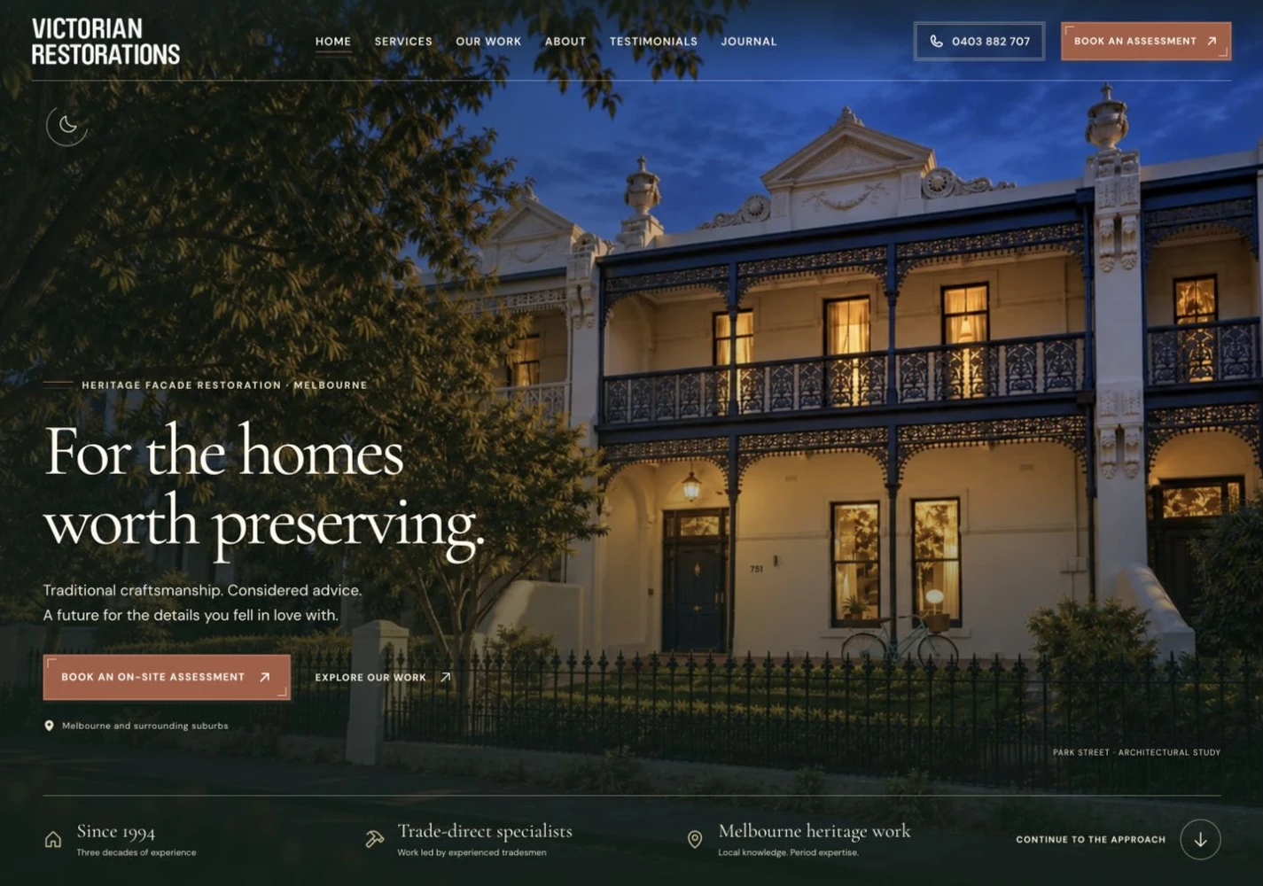
“For the homes worth preserving.” The words connect the specialist’s work with the owner’s attachment to their home. A clear assessment invitation turns that attention towards a practical conversation.
Each screen gets its own composition. Portrait tablets pair a closer architectural crop with larger copy and generous insets. Phones simplify the labels and stack the actions. Supporting credentials follow below, keeping the house and assessment invitation in view. These are actual homepage captures at the same night stage.
Then the light changes
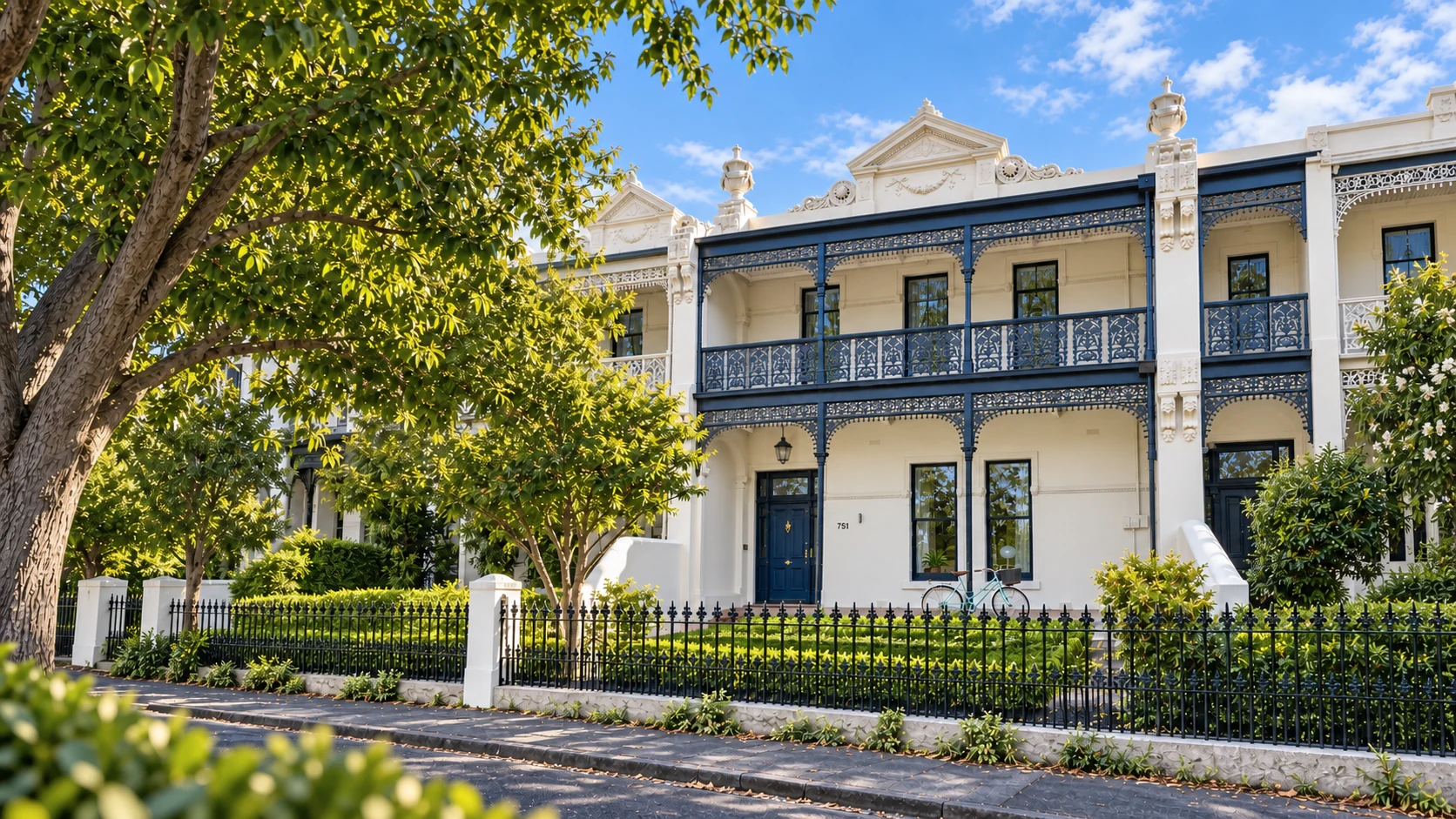
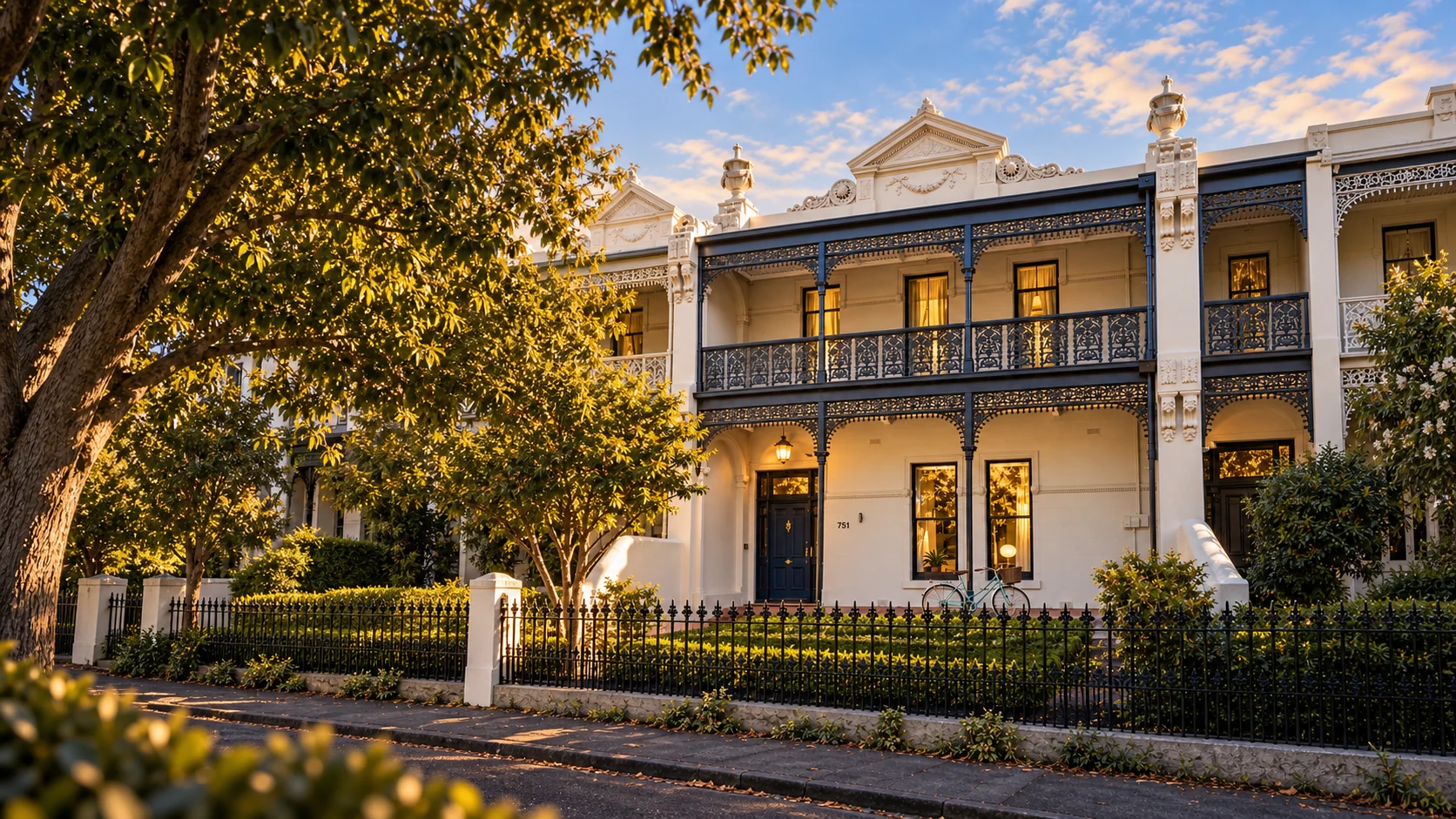
Day softens into evening. Windows glow. The same frontage becomes a home after dark. On the website, scrolling holds the full-screen scene through the change, with a little extra distance to appreciate the night view before continuing.
This is a cropped, manually controlled study. Move the slider to explore the lighting.
02 / From the building to the browser
The facade does more than supply photography. Its symmetry, framed openings, fine lines and ornamental rhythm inform the interface. You can feel a relationship between the work and the website, even before you can name it.
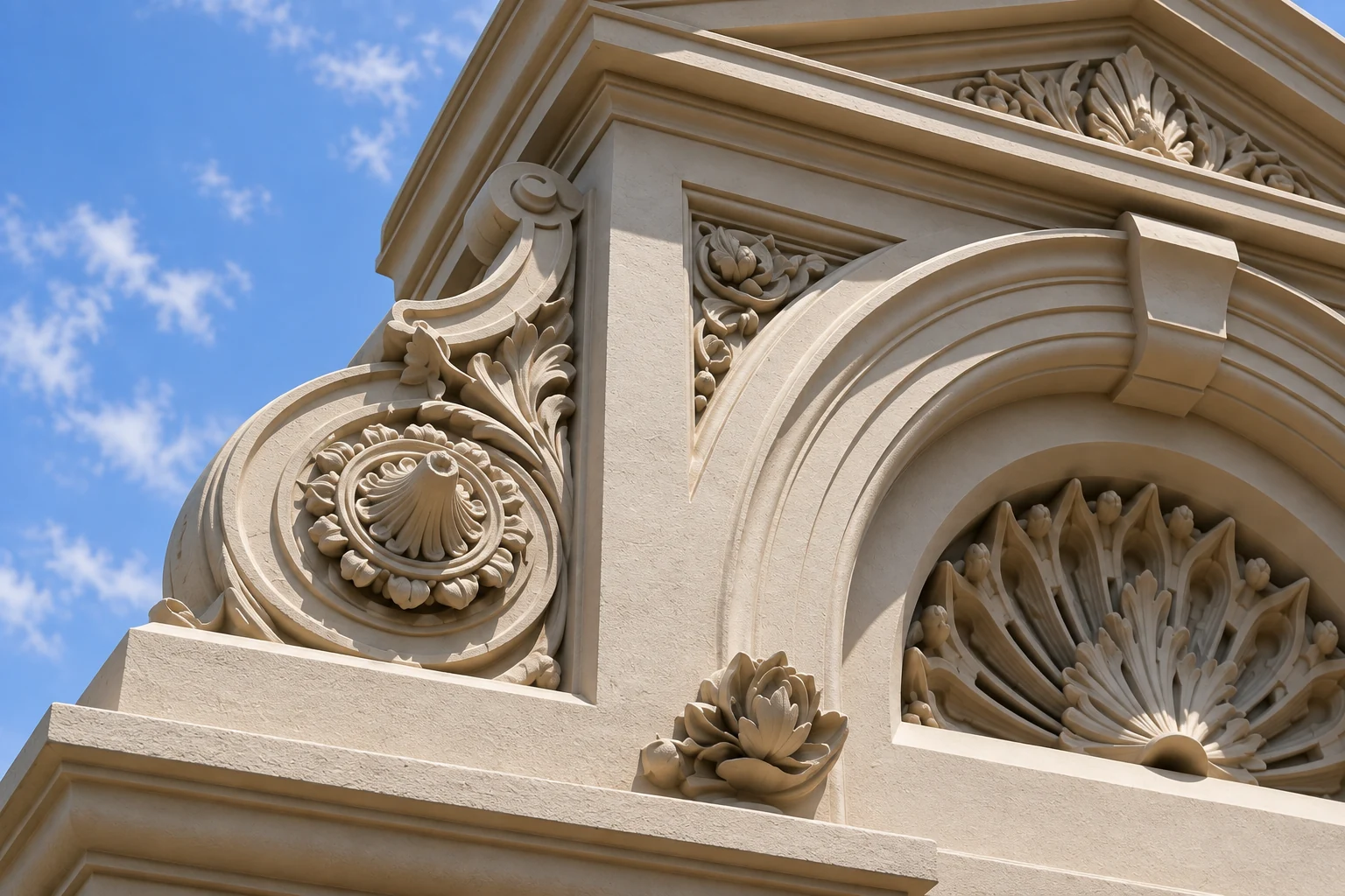
The actual chapter flourish echoes symmetry and scrollwork. Used sparingly, it marks a pause rather than decorating every available space.
Inset borders, fine double rules and square corner details give cards and calls to action an architectural precision.
Cream, charcoal green, rust and muted gold connect reading surfaces and actions to the warmth and restraint of the buildings.
Heritage in the details.
Clarity in the way it works.
Expressive serif headlines give the architecture an editorial voice. Clear body text, restrained labels and obvious controls keep the experience contemporary. Period character never has to mean difficult to read or difficult to use.
03 / Every view earns its place
A homeowner looking at a crack needs a different picture from someone admiring a completed frontage. The imagery changes scale with the question: the whole building for context, a close detail for understanding, a working view for the next step.
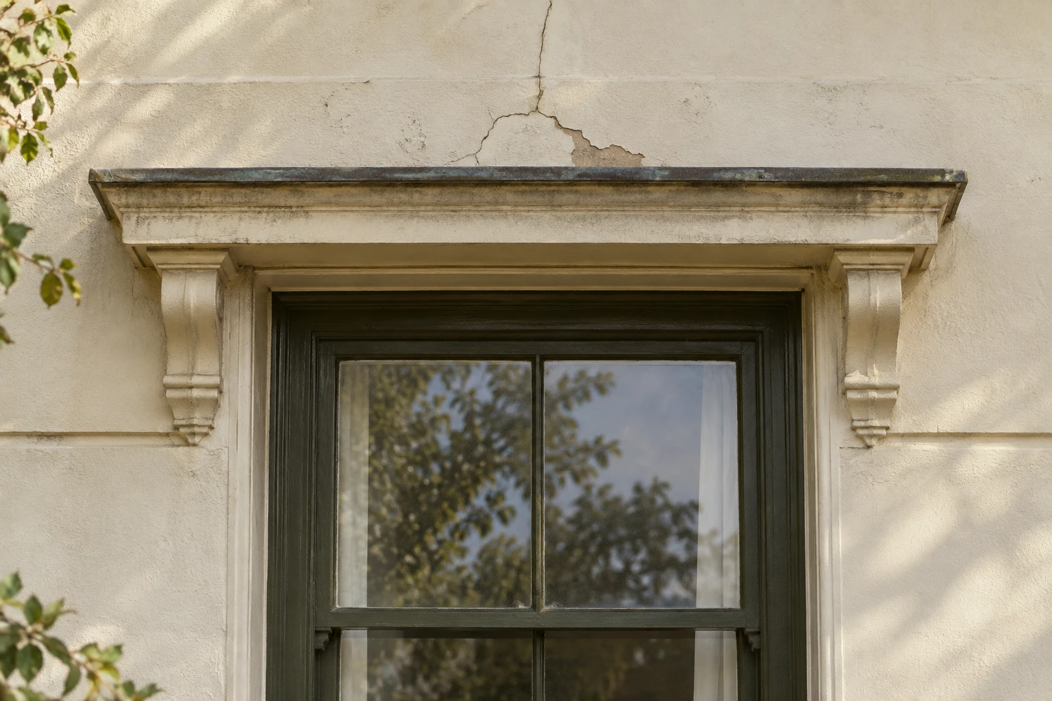
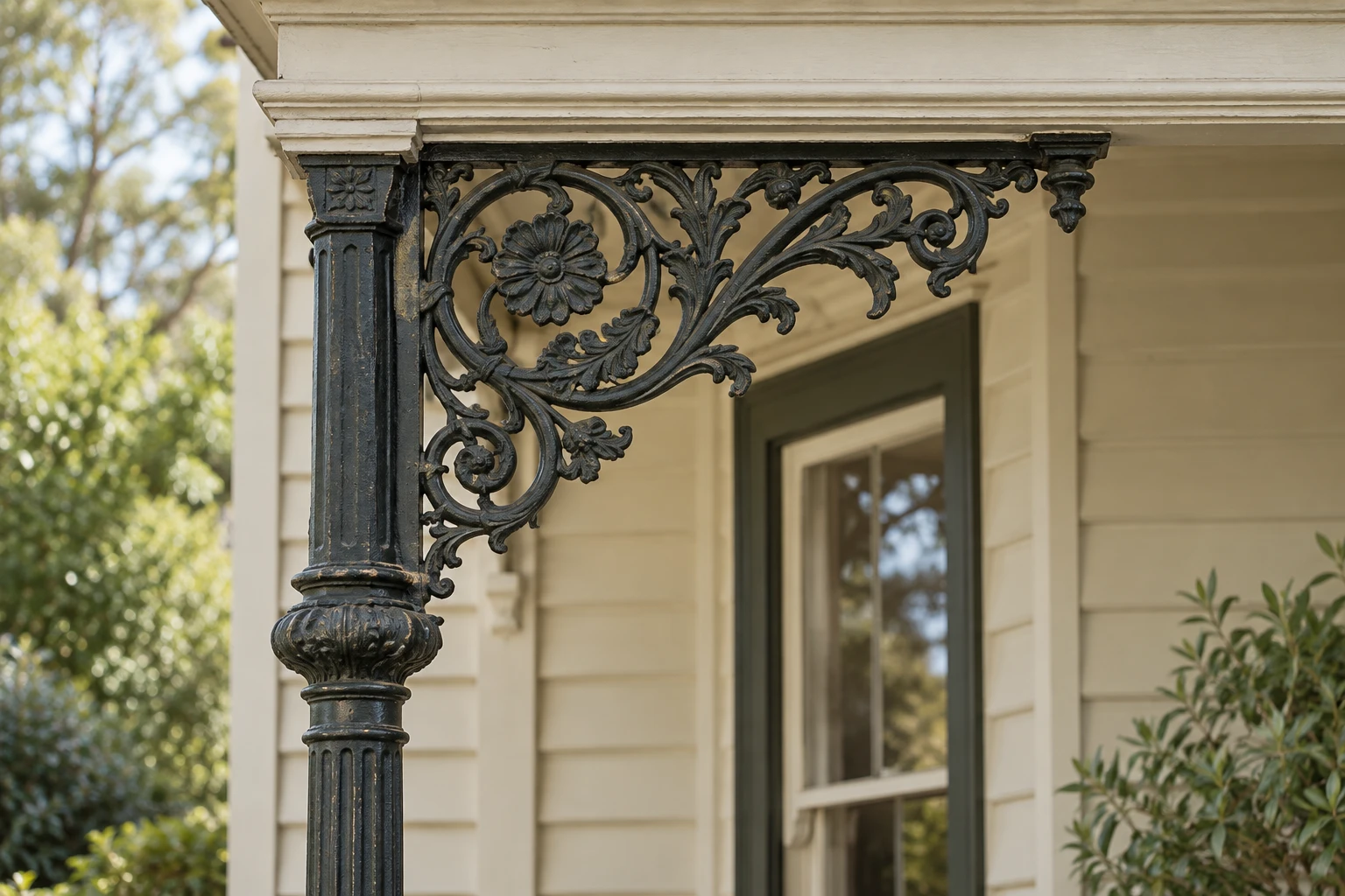
Viewpoint, crop and space for text belong to the same decision. The photograph should show the feature being discussed, including when the layout narrows to a phone.
Distinct editorial images give the services and architectural studies their own subjects. Reusable logos, portrait motifs and image-selector thumbnails provide continuity where repetition is useful.
04 / Attention has a rhythm
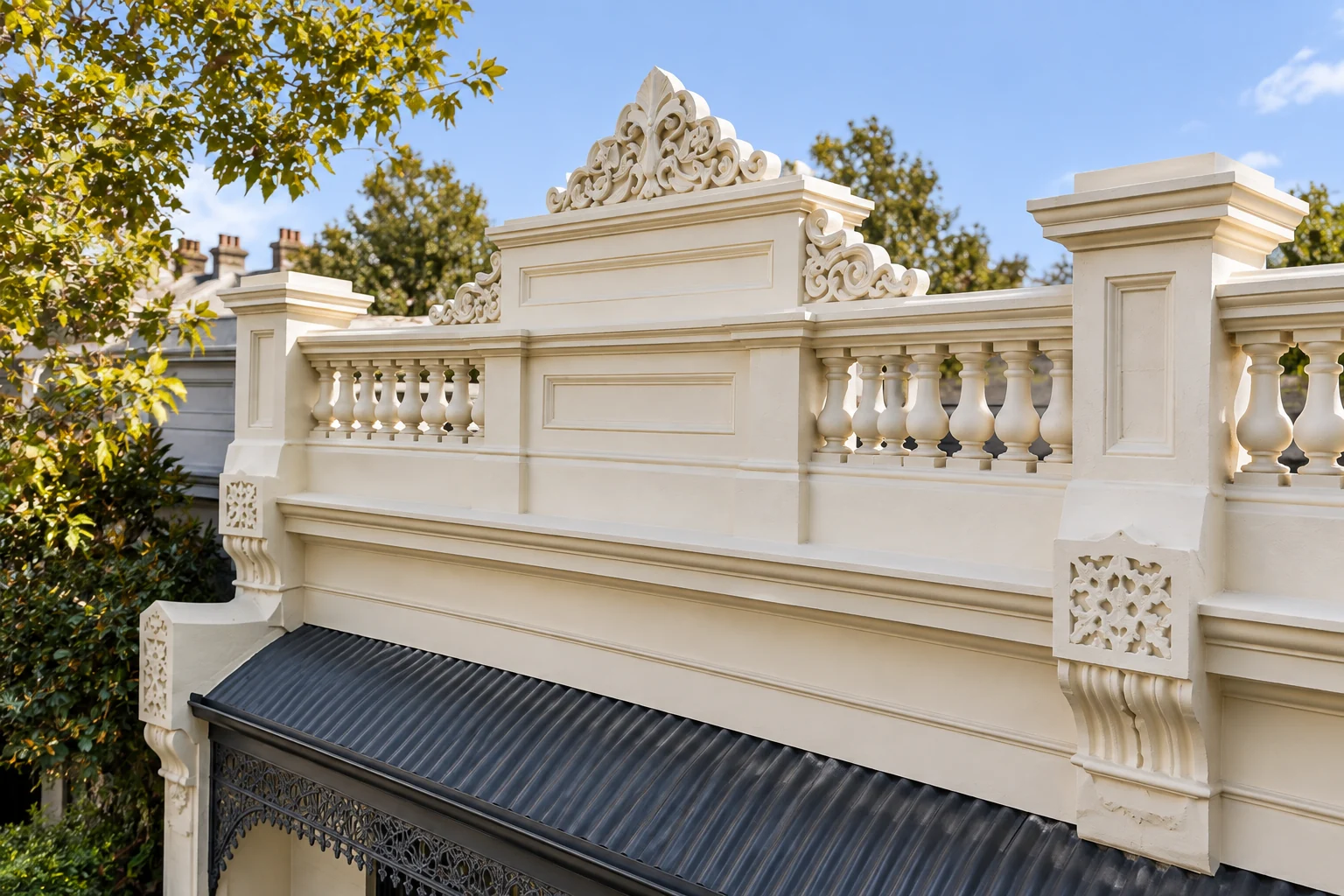
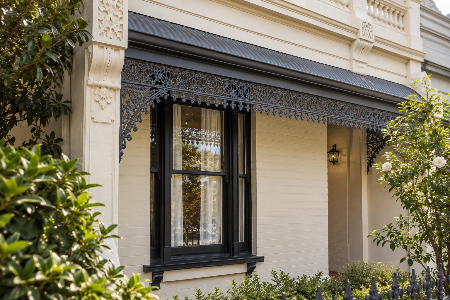
Amess Street unfolds from the whole facade to the parapet crest, then the verandah detail. Each change pairs a closer view with a short explanation, giving the visitor time to notice what makes the building distinctive.
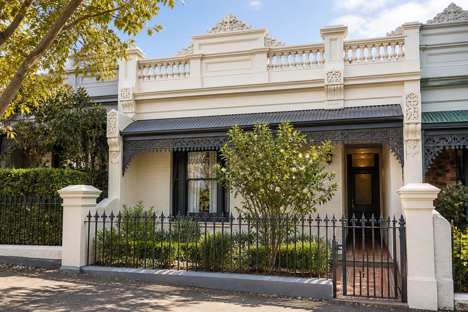
The frontage establishes the relationship between the parapet, verandah, windows and entrance.
Select a view here. The website’s architectural detail chapters also advance with scrolling. These generated architectural views illustrate character and detail; they do not document completed restoration work.
A selected photograph carries you from the collection into the building. As its frame moves into place, the detail-page view appears within it, keeping the crop continuous through the arrival. The next image is prepared before the page changes.
Chapter pacing, the position of the following content and reduced-motion alternatives are part of the experience. The effect should reward attention while leaving the visitor in control.
And a little unexpected life
The testimonial portraits bring the engraved visual language to life with a restrained turn. They are decorative companions to the client’s words, not portraits presented as the clients themselves. On desktop, the turn responds to hover or keyboard focus. On touch screens, a portrait turns and returns once when it comes into view, without needing a tap. Reduced-motion preferences keep it still. The notes remain the reason to read.
A small moment of character
Try the engraved portrait’s small turn. This explicit control is for the story demonstration; decorative portraits on the website are not separate navigation links.
05 / Built around the homeowner
An owner arrives with a question, not a specification. Explore how the website connects that first concern to useful context and a clear way to get in touch.
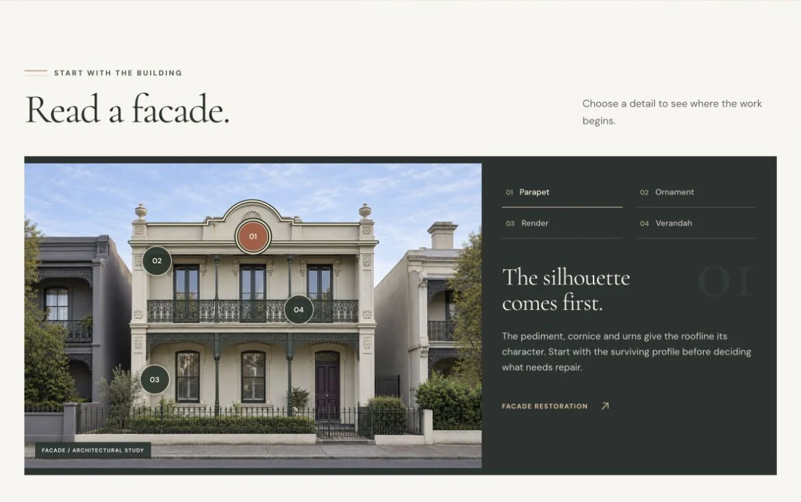
The homeowner’s question
Start with something the owner can recognise. The facade explorer connects a visible detail to a plain-language explanation and the relevant service.
Try the facade explorer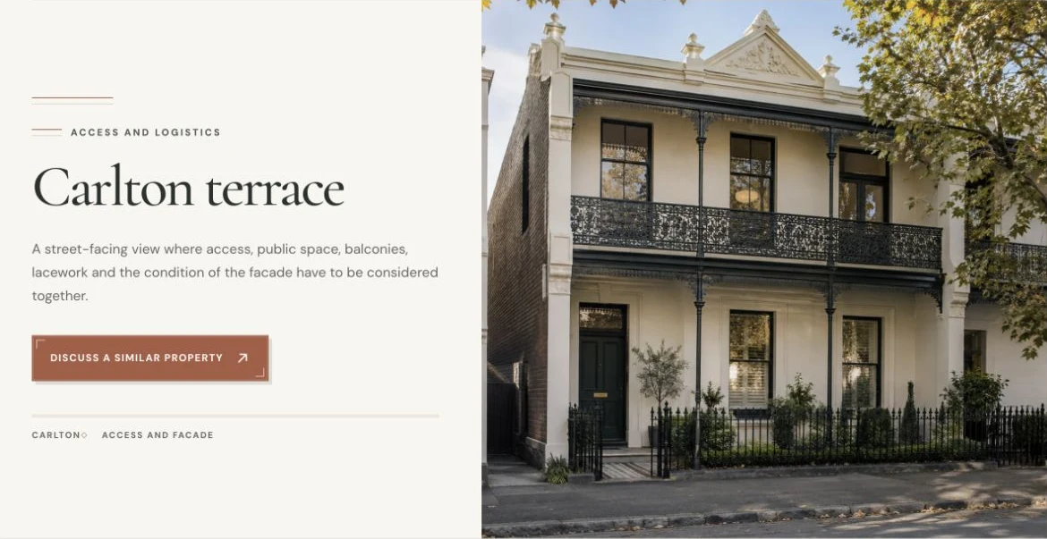
The homeowner’s question
Put the question in context. Architectural studies explain what a building asks of the work, while related guides and client notes help the owner explore further.
Explore the study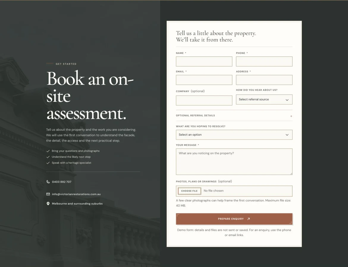
The homeowner’s question
Ask about the home, not a diagnosis. The assessment form invites the owner to describe what they notice and bring photographs, with phone and email routes beside it.
Explore the assessment pageThe aim is a relevant assessment enquiry. This demo does not send or save enquiries; any improvement in enquiry volume or quality would need to be measured after a business launch.
06 / Prepared to be found. Written to answer.
The website is designed for people who arrive with a question, not just people who already know the business. Descriptive services, useful Journal content and connected pages give discovery a substantive foundation.
A real topic from the Journal
A specific concern leads to an explanation of compatibility, moisture and the questions to ask before a repair.
Explore the JournalDescriptive headings, distinct service explanations, related pages and practical questions make the subject easier to explore.
Descriptive page titles, meaningful addresses and connected content establish the editorial groundwork. The portfolio-hosted demo is deliberately excluded from search indexing. A business launch would need its own domain, crawlable page delivery and indexing checks.
Structured business, service, article and question-and-answer information reflects the page content. Clear answers matter more than a separate layer of AI buzzwords.
SEO, AEO and GEO describe related discovery ambitions. These are content and implementation foundations, not a promise of rankings or AI citations. The demo does not compete with the business’s official website in search. Google states that its usual SEO principles also apply to its AI search features. Read Google’s guidance
07 / A website with a future
A new service, another guide, a different collaborator: the website will need to grow. Its design system keeps the decisions available, so future work can extend the identity instead of slowly diluting it.
The shared reference
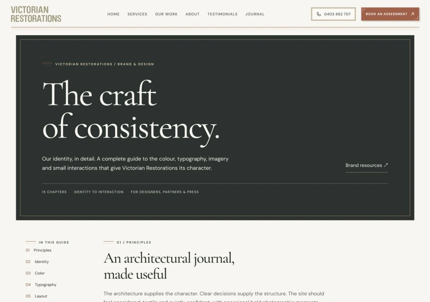
The guide makes decisions inspectable. A collaborator can see the intended result; an AI-assisted workflow can work from explicit rules. Both have something concrete to check against.
Explore Brand & DesignNow explore it yourself
Follow the light. Open a study. Read a client’s note. The architecture earns attention. The content builds understanding. The experience gives a homeowner a clear way to start a conversation.
Explore the website previewWorking redesign demonstration. Opens in a new tab. The business’s official website remains separate.
The research, decisions and delivery behind it